
This is a conceptual design project
Ripple+ is an aromatic diffuser company that specializes in crafting alternative products to nicotine vapes. They offer a wide selection of nicotine-free diffusers featuring intriguing flavors, and they regularly introduce new ones.
Ripple+ contacted me to devise a digital marketing campaign for their latest flavor, "Soothe." This particular flavor boasts a delightful combination of honey and lemon aromas, and the overall concept draws inspiration from retro honey packaging and modern-day cold and flu graphics. Additionally, there is a focus on fostering new habits, aligning with the planned release of this flavor in January 2024.
Stickers

Ripple+ introduces new flavors, and with each launch, they include stickers. For the latest flavor, Soothe, I drew inspiration from vintage medicine and honey packaging, as well as cold and flu packaging, and created two sticker designs.
The first design was heavily influenced by honey bear bottles, featuring the placement of the Ripple+ diffuser product. My goal was to capture the nostalgic essence associated with vintage honey packaging.
The second design is a blend of various elements from the moodboard, reflecting the inspiration from vintage medicine and honey packaging. Here, I focused on replicating the playful and whimsical aspects of those vintage designs.
This approach allowed me to tie the theme of the new flavor directly into the accompanying stickers, giving customers a tangible and visually appealing representation of Soothe and its inspiration.
Every package of Ripple+ aroma has a sticker printed on the packaging and I thought the honeybear sticker is fitting.
Instagram Post
The second task was to create a design for Instagram. The designs for Ripple+ aromas feature the flavor in the background, placing the product center stage. The second page includes an animated diffuser. I wanted to incorporate this style into his post for “Soothe”.
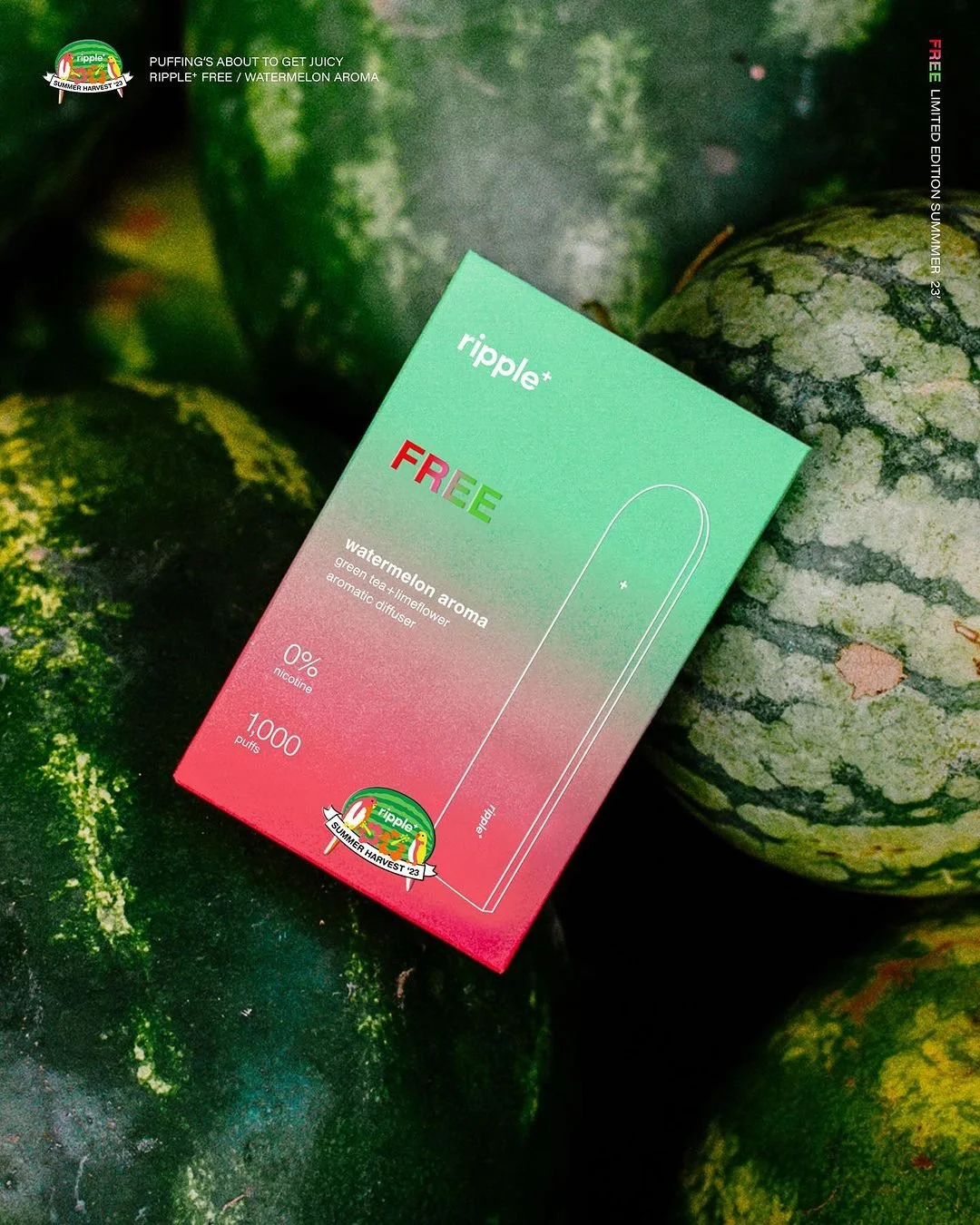
This post is an from their Instagram, this flavour is called Free. It has watermelon as the main focal point of the visuals.
I reviewed the previous Instagram launch posts and aimed to maintain the existing branding while making this launch feel unique. On the first page, I emphasized the prominent presence of both lemon and honey in the composition. On the second page, I focused on creating a highly satisfying background animation to complement the rotating aroma diffuser.
Here are some of the previous email newsletters.
EMAIL NEWSLETTER
Upon reviewing the previous aroma launch email newsletters, I noticed a consistent layout, particularly with the bottom section featuring content that ties in well with each launch’s concept. Based on this, I decided to create content for the Soothe newsletter that follows a similar fitting style.
I aimed to emphasize the gooey texture of honey and create a highly satisfying artboard. To enhance this effect, I designed the bottom two assets with dripping honey elements. I also incorporated 3D chrome titles, mirroring the title style used on the packaging. Certain aspects of the email campaign were inspired by modern medicine packaging, tying the theme together.


Some of the rendered titles from the email newsletter which also replicates the Chrome-like effect of the “Soothe” title on the packaging.
Facebook AD
In addition to the email newsletter, Ripple+ asked me to create a Facebook advertisement post. For this design, I drew inspiration from retro-style character designs—specifically those from the golden age of animation, such as Steamboat Willie.

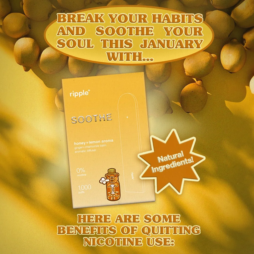
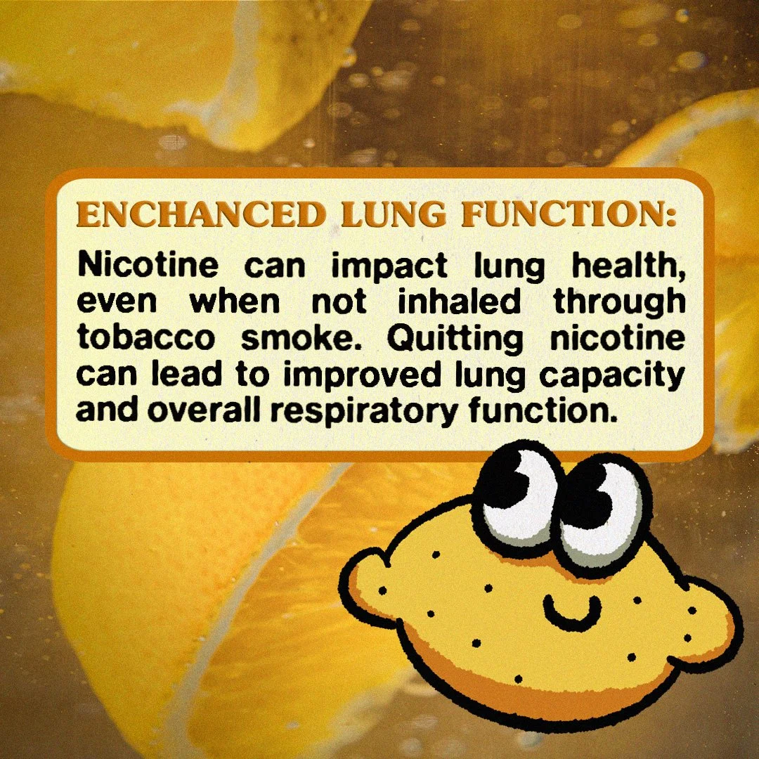

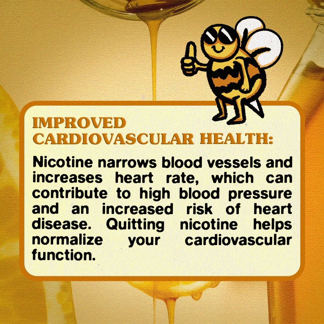
To maintain consistency with the stickers and earlier style choices, I wanted to bring everything together with the Facebook carousel ad. My primary emphasis for the ad was on New Year’s resolutions and highlighting the benefits of quitting nicotine use. The intention was to encourage people to consider Ripple+ as an alternative.
